Design Sprint Process
Collaborating with two other designers, we followed an agile design sprint process— meeting weekly with the client, understanding requirements, whiteboarding solutions, and presenting inspiration to align on vision.
Financial Services Client
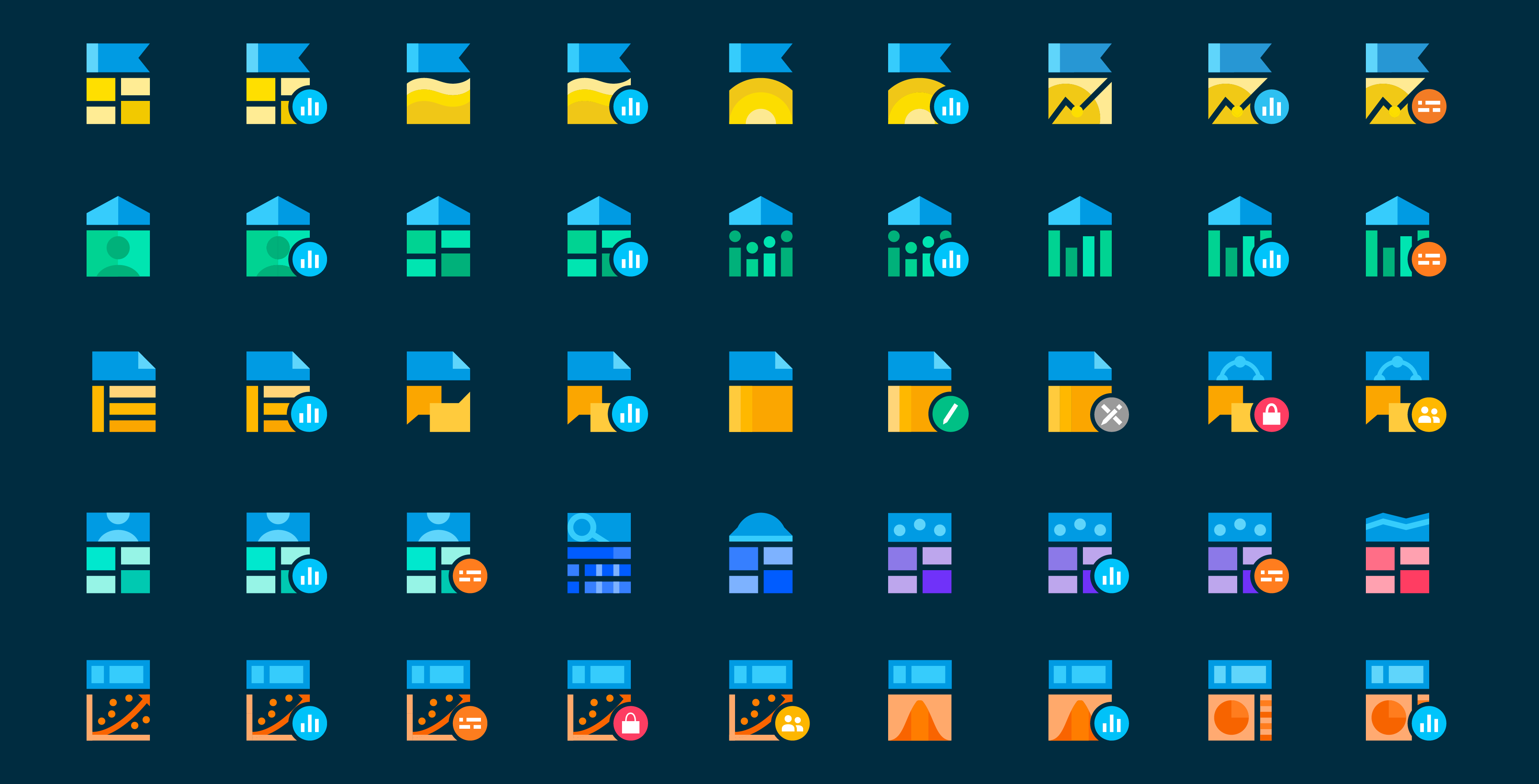
Created a comprehensive icon library and design system to unify a fragmented platform of investor applications into a cohesive user experience.
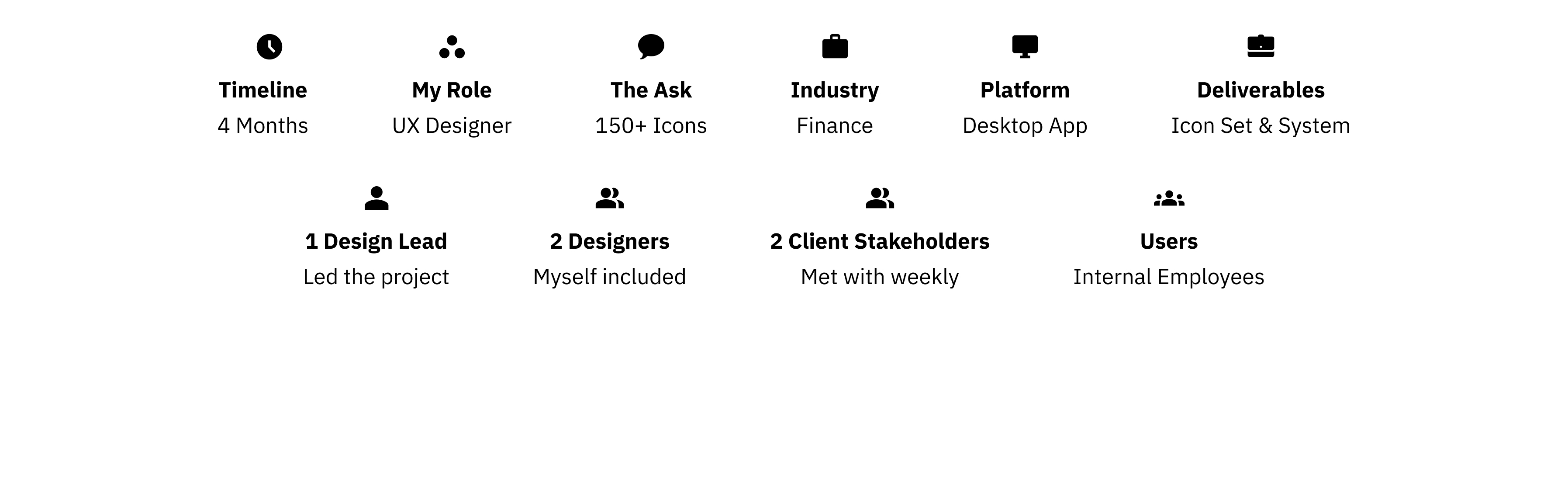
Icon Designer
Design system creation, consulting
150+ Icons
Full design system documentation
Disjointed Experience
Unify overlapping applications
Finance
Investor platform applications
Collaborating with two other designers, we followed an agile design sprint process— meeting weekly with the client, understanding requirements, whiteboarding solutions, and presenting inspiration to align on vision.
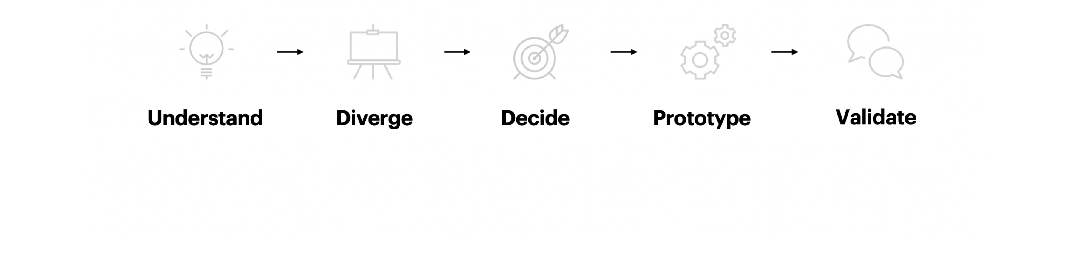
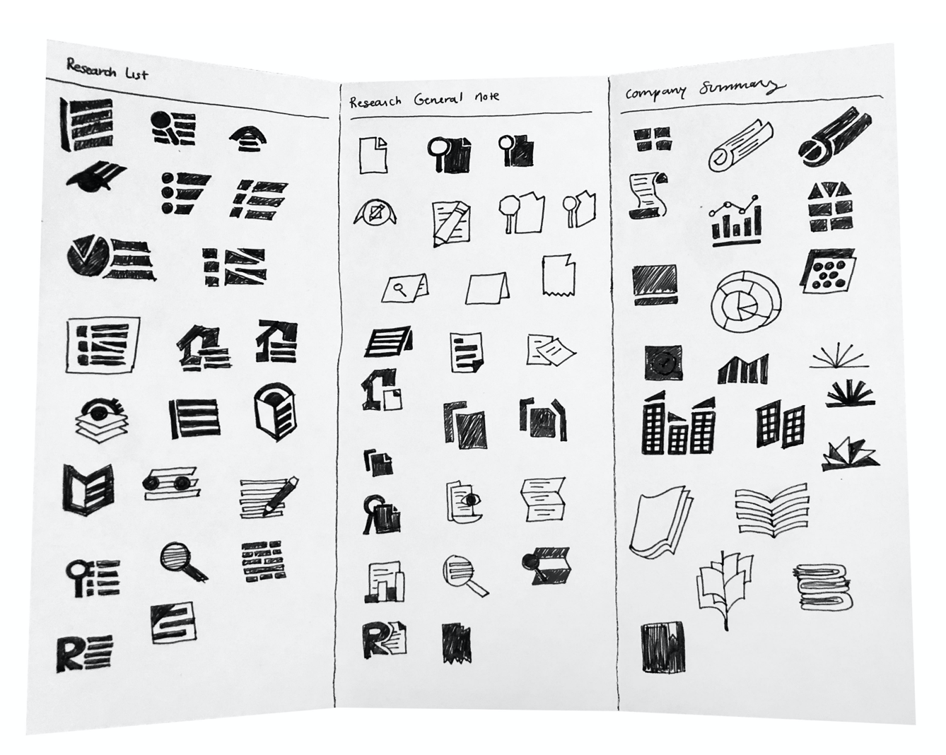
We took a divide-and-conquer approach, each creating different directions. The client selected elements from all our designs, which we synthesized into a cohesive 150+ icon set with comprehensive design system documentation.
We explored three separate design directions through sketches and moodboards.
Created a comprehensive design system ensuring future teams can create consistent icons for new applications.
In the end, we were able to apply the icons to the application and showcase our work to the client and users.
 InVision Prototype